Want to know the story behind the Winners Alliance brand?
Every element of the visual identity ties back to Winners Alliance’s mission to empower athletes to win on and off the court.
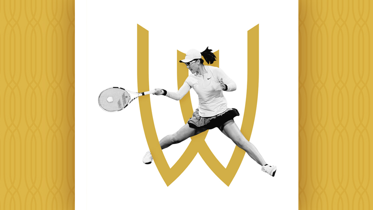
The W, the brand’s core mark, is not only indicative of the company’s name – it’s indicative of what it looks like to win. The structure of the W was developed using inspiration from victorious icons throughout sports. The shape is reminiscent of a triumphant athlete with their arms raised in victory; a champion’s trophy; a celebratory toast.
The two overlapping shapes in the mark serve as a testament to the full athlete experience and Winners Alliance’s role in supporting athletes – and helping them win – both on and off the court.
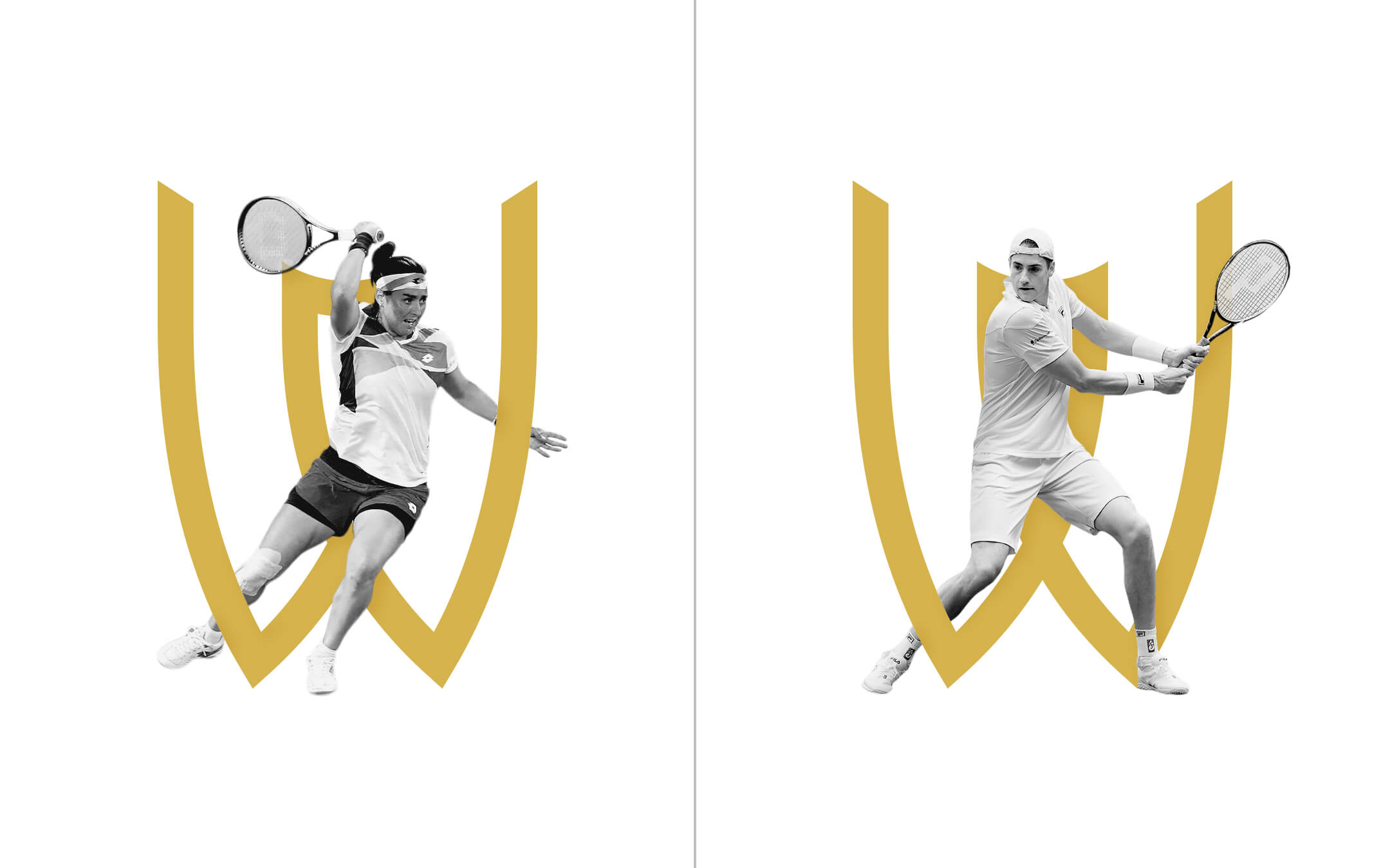
Winners Alliance believes that winning is unlimited – that’s why the motion of the W’s edges are aimed skyward. Continue extending the lines of the mark, and a pattern is created that reflects a core element of the Winners Alliance brand: collective. Winners Alliance supports athletes at scale, and the strength of the brand stems from the collective power of athletes.

The brand’s shorthand of “Win All” is an homage to Winners Alliance’s role in the athlete experience. We create commercial opportunities for athletes so they not only win on the court – they Win All.
![]()